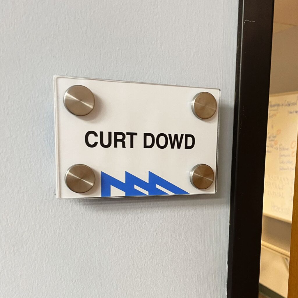
Interior door signs are an essential element of a professional office appearance. Clear signs don’t just simplify navigation for your clients and employees. They give your office extra visual authority and help promote your brand.
OakSpy Signs and Graphics has a wide selection of door office signs that match any professional space. Our products can streamline your office transformation and bring new business to your doorstep.
Clear and Visible Door Signage
Clear and visible office door signage enhances workplace navigation and reduces confusion. It allows employees and visitors to find their way around the building, improves overall work efficiency, and creates a professional environment.
When designing and placing professional door signs for your office, you need to consider three main elements:
- Size and Font Type: Choose a size and font type that you can easily read from a distance. Avoid overly decorative styles that can be hard to decipher.
- Color Contrast: Select colors that strongly contrast the text and the background. High contrast enhances readability, especially for people with vision impairment.
- Lighting and Visibility: Make sure signs are visible under various lighting conditions. Choose materials that minimize glare and reflections to maintain clarity at all times.
The goal is to achieve maximum visibility while maintaining appeal and consistency throughout your office space.
Consistent Signage System
A consistent signage system creates a cohesive and organized environment for everyone in the building. It also supports your branding efforts and helps avoid downtime. Before choosing door office signs, consider working out organizational standards for their design. They should include:
- Uniformity in Style and Format: Consistency in design elements like font, color, and size maintains a professional look and makes signs easily recognizable.
- Standardized Language and Symbols: Use the same language and symbols across all signs. It’s vital to ensure comprehension, especially if your employees and visitors have different levels of language proficiency.
- Centralized Signage Management: Have one person or team manage all interior door signs. This will prevent inconsistent implementation.
The goal is to ensure that the signs in your entire office space are the same type. This will simplify navigation and prevent unnecessary confusion.
Accessibility and Inclusivity
When purchasing and installing door office signs, you have to consider all groups of users who will be taking advantage of them. To ensure accessibility and inclusivity, pay attention to:
- Use of Braille and Tactile Elements: Incorporate braille and tactile elements to ensure accessibility for visually impaired individuals.
- Appropriate Height and Placement: Place door signs adequately to accommodate all users, including those in wheelchairs.
- Multilingual Signs: If appropriate, use multilingual signs to cater to a diverse workforce and clientele.
- Inclusive Symbols and Images: Incorporate inclusive symbols and images representing various abilities and cultures.
The main goal is to make everyone in your office feel comfortable. Besides fostering a culture of inclusivity in the workspace, properly chosen signs can help avoid navigation errors.
While you are taking care of accessibility and inclusivity, consistency remains important. Ensure you maintain the same style regardless of the type of sign you are using.


